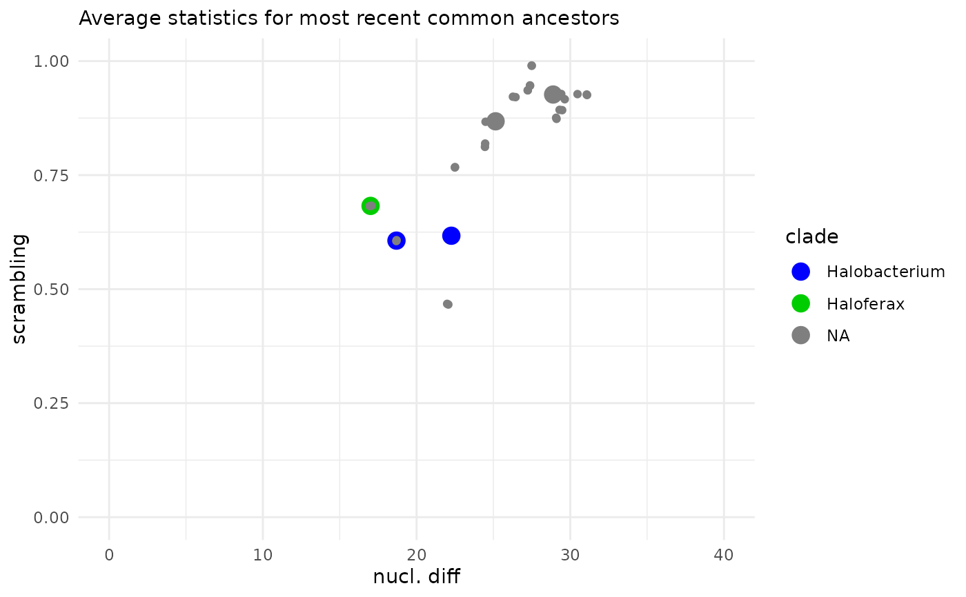
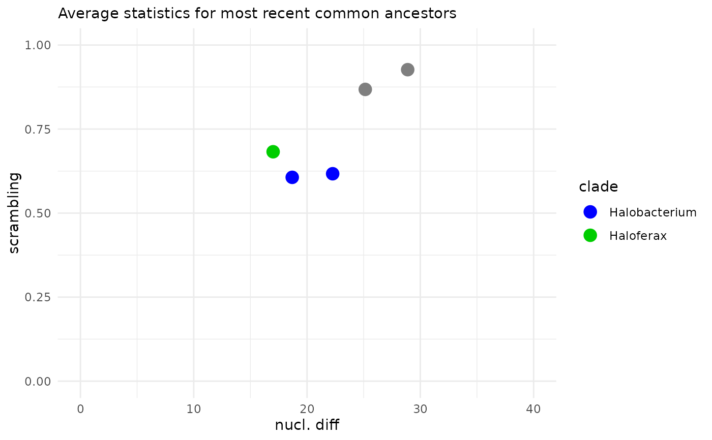
2D plot of the statistics extracted for each MRCA.
Arguments
- tb
A tibble produced by
MRCAs.- errorbars
Plot the error bars?
- xlim, ylim
Maximal X and Y value.
See also
Other Plotting functions:
ellipsePlot(),
treeHeatMap(),
visualizeTree()
Examples
(p <- MRCAs(Halo_DF, Halo_FocalClades) |> MRCA_2D_plot() +
  ggplot2::labs(x="nucl. diff", y="scrambling"))

p + ggplot2::geom_point(
  data=Halo_DF,
  ggplot2::aes(x = percent_difference_local,
               y = index_avg_strandDiscord,
               color = focalClade))
p + ggplot2::geom_point(
data=Halo_DF,
ggplot2::aes(x = percent_difference_local,
y = index_avg_strandDiscord,
color = focalClade))